Turning Nature Into a Quilt Color Palette: Choosing Fabric Color based on a Photograph
If you ever find yourself staring at your fabric stash thinking “I know I want to make something… but what colors should I use?” — nature is one of the best designers you’ll ever meet.
A photograph of something in nature — a sweeping landscape, a cluster of flowers, even the colors in a bowl of fruit — can become the starting point for a beautiful quilt palette.
Nature has already done the hard work of combining colors in ways that feel balanced, interesting, and alive. When you learn how to pull colors from a photograph and translate them into fabrics, you suddenly have an endless source of quilt inspiration.
And the best part? The process is simple and surprisingly fun.
Why Use a Photograph for Color Inspiration?
Many quilters struggle with choosing colors because we tend to think about them individually.
“Do these reds go together?”
“Is this blue too dark?”
“Will this green clash with that yellow?”
But when colors come from a photograph, they already belong together.
Nature rarely uses just one shade of a color. Instead, it blends:
- lights and darks
- warm and cool tones
- soft neutrals with bold accents
That natural variation creates depth and visual interest—exactly what we want in a quilt. A photograph helps you capture that relationship between colors instead of choosing them one by one. Let me show you how it works.
Step 1: Start With a Photograph
Choose a photo that catches your eye. It doesn’t have to be complicated. Some of the best photos for this technique include:
- Landscapes
- Gardens or flowers
- Forest scenes
- Ocean or lakeside views
- Close-ups of plants
- Still lifes (like fruit or flowers in a vase)
Look for images with a clear range of colors rather than just one dominant tone.
For example, a landscape might include:
- sky blue
- forest green
- warm earth tones
- soft neutrals from rocks or sand
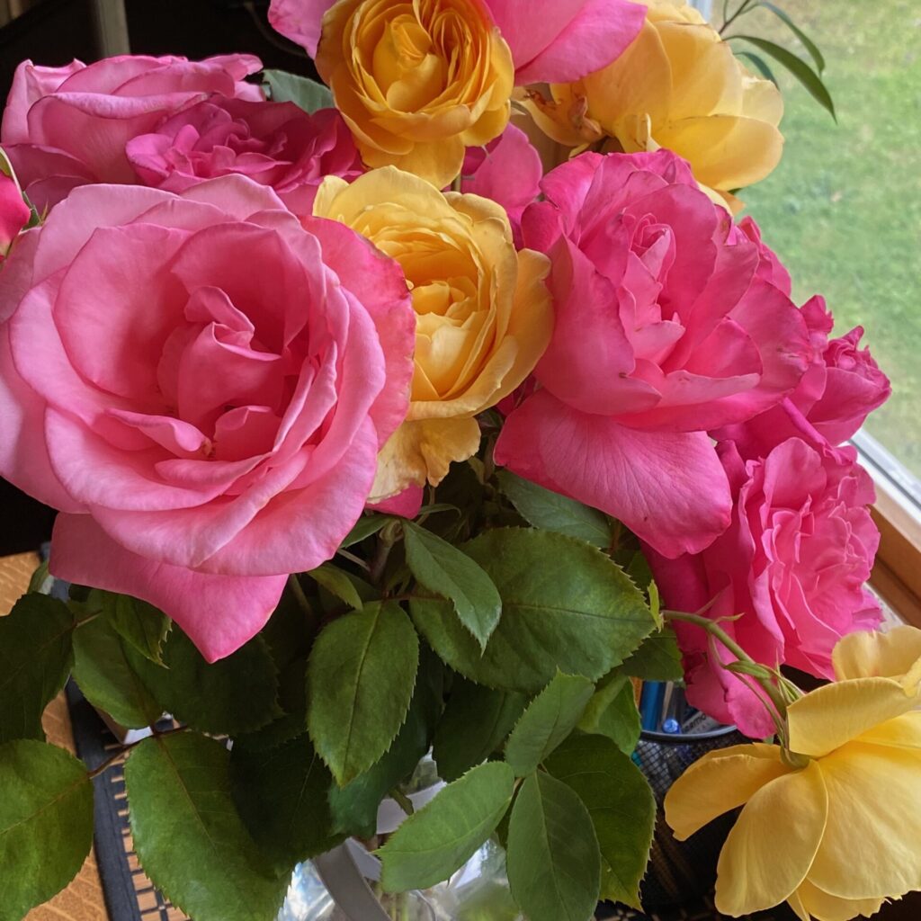
Those color variations will translate beautifully into fabric. For the sake of this exercise, let’s use a photograph I took of a vase of roses from my garden.
Step 2: Identify the Key Colors
Now look at the photo with a quilter’s eye. Instead of focusing on the objects in the picture, focus on the colors themselves.
Ask yourself:
- What is the dominant color?
- What secondary colors support it?
- Are there any small “accent” colors?
- Where are the light and dark values?
Most quilts (except for landscapes and portraits) work beautifully with 5–8 colors, including lights and darks. You don’t need to capture every color in the photo — just the ones that define the feeling of the image.
For this example, the colors I pulled from the photograph were:
- Pink
- Yellow
- Green
- Black
- Tan
Step 3: Think in Values, Not Just Colors
This step is the secret ingredient. A quilt made from only medium-value fabrics will look flat — even if the colors are beautiful.
When studying your photo, look for:
- Light values – highlights, sky, pale petals
- Medium values – foliage, water, background tones
- Dark values – tree trunks, shadows, deep leaves
Try to represent each value when choosing fabrics. This contrast is what allows the quilt design to shine.
For example, looking back at the photograph of the roses, you’ll notice that while the roses are pink and yellow, there are several shades or values of both the pink and the yellow. So … instead of choosing one pink and one yellow fabric to represent the roses, I would look a little more closely and choose several shades of each of these colors to represent the roses. That will give the roses lots more depth and movement.
The same is true for the leaves in this image – there are several variations of green represented, depending on where the sun and the shade hit each of the leaves.
Step 4: Go “Shopping” in Your Fabric Stash
Now comes the fun part — pulling fabrics. Using your color palette as a guide, start looking through your stash for fabrics that represent those colors.
A few tips:
You don’t need exact matches. Fabric interpretation is part of the creative process. Look for fabrics that capture the spirit of the color rather than the precise shade.
For example, a:
- Mottled green might represent several shades of leaves.
- Blue-green batik could capture the movement of water.
- Soft neutral print might echo the texture of sand or stone.
Pull more fabrics than you think you’ll need at first. Then begin narrowing them down.
Step 5: Arrange and Edit Your Palette
Lay the fabrics out together and step back. This is the moment when the palette starts to come alive.
Ask yourself:
- Do I have a good mix of lights, mediums, and darks?
- Is one color dominating too much?
- Do I need a small accent color?
Sometimes a palette needs just one unexpected fabric to bring it to life. Don’t be afraid to swap fabrics in and out until the collection feels balanced.
I’ve chosen three of my own photographs to play with, and I’ve shopped my stash to see how close I could get to representing each of these images.
Example 1:
I couldn’t resist using a picture of Louie. Although he is no longer with us, we have such good memories, and this is one of my favorite pictures of him.
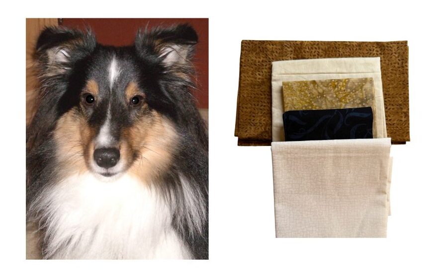
That bottom fabric is actually much whiter than it shows in the picture. I think this group of fabrics captures the colors in the photograph pretty well. I can see using this palette in a quilt that pulls a little more modern or masculine.
Example 2:
Last fall, we spent some time in the Olympic National Forest and the Olympic Peninsula. So much beauty in this part of NE Washington. One of the places we visited was Hurricane Ridge, where I took this image looking out over the Olympic National Forest. The view was stunning, even if the colors were a bit muted due to forest fires in the distance.

That top blue may be a little bright to accurately represent this photograph, but it’s what I had in my stash. I would probably replace that one with a blue that was a little more “greyed” out if I were going to replicate this image in fabric.
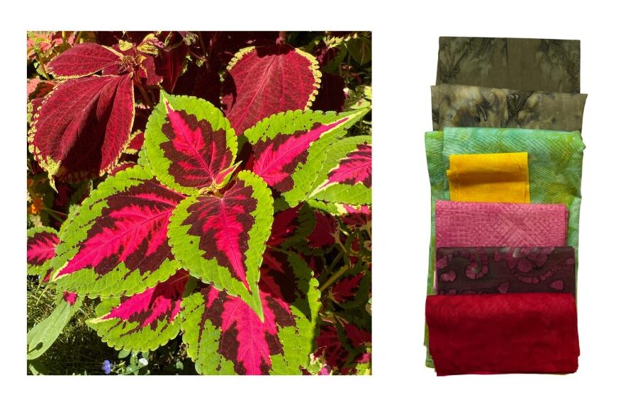
Example 3:
I took this picture of some coleus I had in a pot on my patio. I love using coleus for pops of long-lasting color! My stash included some great color matches for this photograph.
This was a fun exercise to pull fabric from my stash based on these three images. Now … does that mean that I’m going to replicate these images in fabric? Not necessarily. What it does give me are palettes of fabrics that clearly go together – although without the photographs, I probably wouldn’t have put them together. With each of these color palettes and the right pattern, I could make some beautiful quilts.
Why This Technique Is So Powerful
Once you start using photographs to build color palettes, a few wonderful things happen.
First, you begin to see color differently. Suddenly, a walk outside becomes a source of quilt ideas.
Second, you stop worrying so much about whether colors “match.” If they came from the same photograph, chances are they already work beautifully together.
And finally, this technique can breathe new life into your stash. Fabrics that never seemed to belong anywhere may suddenly become perfect when they’re part of a nature-inspired palette.
A 5-Minute Exercise to Train Your Eye for Color
One of the wonderful side effects of using photographs for color inspiration is that you start to notice color everywhere.
Here’s a quick little exercise you can try that only takes a few minutes — and it’s surprisingly fun.
Step 1: Take a Photo
Grab your phone and take a quick picture of something nearby. It might be:
- a plant in your garden
- a bowl of fruit on the counter
- the view out your window
- flowers in a vase
- even a stack of folded quilts
Don’t overthink it. The goal is simply to capture a scene that contains a mix of colors.
Step 2: Zoom In
Now look at your photo and zoom in on different areas.
You’ll start to notice something interesting: what looked like “one color” from a distance is actually made up of several shades.
For example, a single green leaf might contain:
- yellow-green highlights
- medium leafy greens
- cool blue-green shadows
- deep forest tones
Nature rarely uses just one version of a color.
Step 3: Identify 5 Colors
Choose five distinct colors from the photograph. Don’t worry about naming them perfectly. Just identify them visually.
You might notice something like:
- soft sky blue
- dusty sage green
- warm golden yellow
- muted coral
- deep charcoal
Now you have a ready-made quilt palette and are ready to choose your fabric colors.
Step 4: Translate to Fabric
Take those five colors to your fabric stash and see what you can find.
You may discover that fabrics you’ve owned for years suddenly make perfect sense together when they’re connected through a photograph.
That’s the magic of working with nature’s color combinations.
Try It Yourself: Color Palette From Nature Checklist
Use this checklist the next time you want to build a quilt palette from a photograph.
Nature-Inspired Quilt Palette Checklist
[1] Choose a photograph that inspires you
[2] Look for 5–8 key colors in the image
[3] Identify light, medium, and dark values
[4] Create a simple color palette from those colors
[5] Pull fabrics from your stash that represent each color
[6] Include a mix of lights, mediums, and darks for each color
[7] Lay the fabrics out together and evaluate the balance
[8] Swap fabrics in or out until the palette feels right
[9] Take a photo of your final palette for reference
[10] Start planning your quilt!
Have Some Fun With This Process of Choosing Fabric Color
Nature doesn’t make mistakes with color; if we follow her lead, we can come up with some stunning combinations, and our projects will coordinate beautifully.